The Zebra
Scalable Online Checkout
The Zebra’s first online insurance checkout experience, enabling users to purchase directly on our platform by integrating with major carriers, simplifying complex policy flows, and driving a 30% increase in active policies.
Senior Product Designer
2021-2022
Consumer - Web
Insurance
PROBLEM
87% of users prefer to buy online
The Zebra is a free insurance comparison tool that helps users compare policies and rates across multiple insurance companies and verticals.
Currently, users are only able to purchase a policy through the carrier's external site or on a call with a licensed Zebra agent. Research shows that 87% of users prefer to buy the policy online rather than with an agent.
SELECT VERTICAL
ANSWER QUESTIONS
COMPARE CARRIERS
CHOOSE PATH
How might we boost online policy sales so The Zebra can grow the business and get more active policies?
SOLUTION
Build a checkout experience to buy insurance online via The Zebra by integrating directly with insurance carriers.
METRICS
↑Active policies
↑Funnel conversion
↓Agent contact rate
ROLE
Led end-to-end UX design by collaborating cross-functionally with Product, Engineering, Legal, Research, and Content to define MVPs, facilitate solution workshops, deliver developer-ready assets, and ensure high-quality implementation through continuous reviews and stakeholder alignment.
DISCOVERY
New to the insurance space, I began with a competitive analysis to quickly get up to speed on the landscape and user expectations.
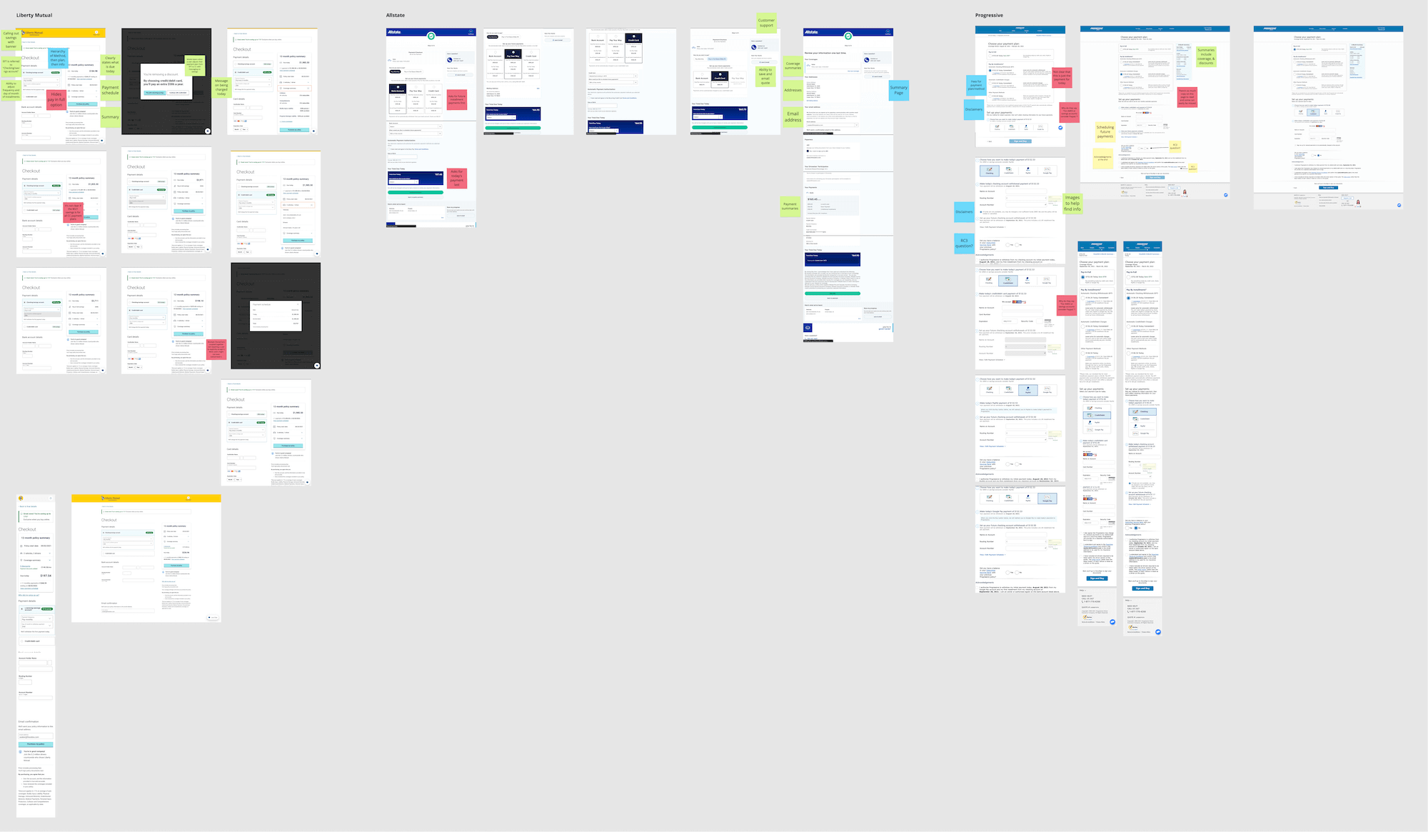
There were four key parts needed for online purchasing
These were necessary for a carrier to underwrite and offer a policy.
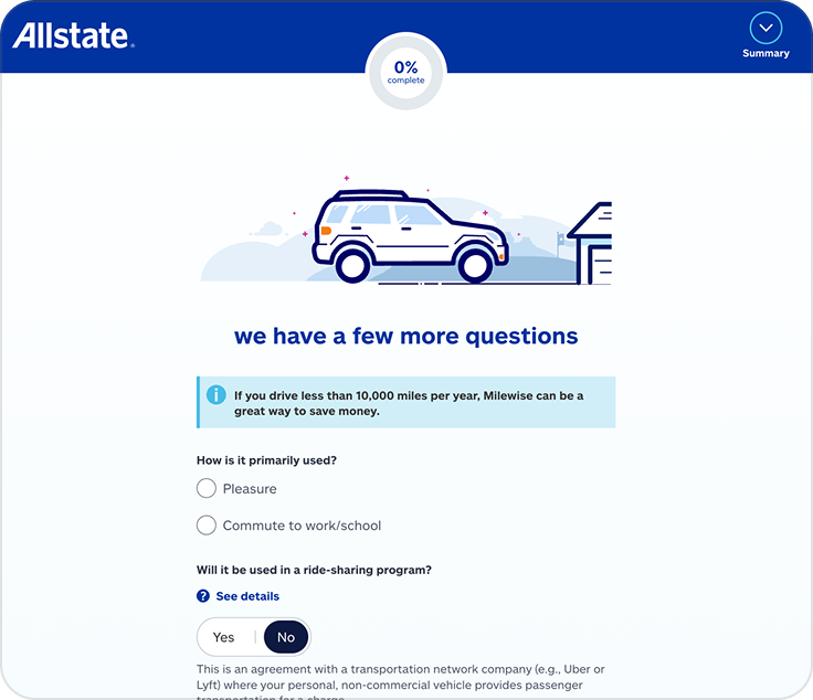
OBTAINING DRIVER HISTORY
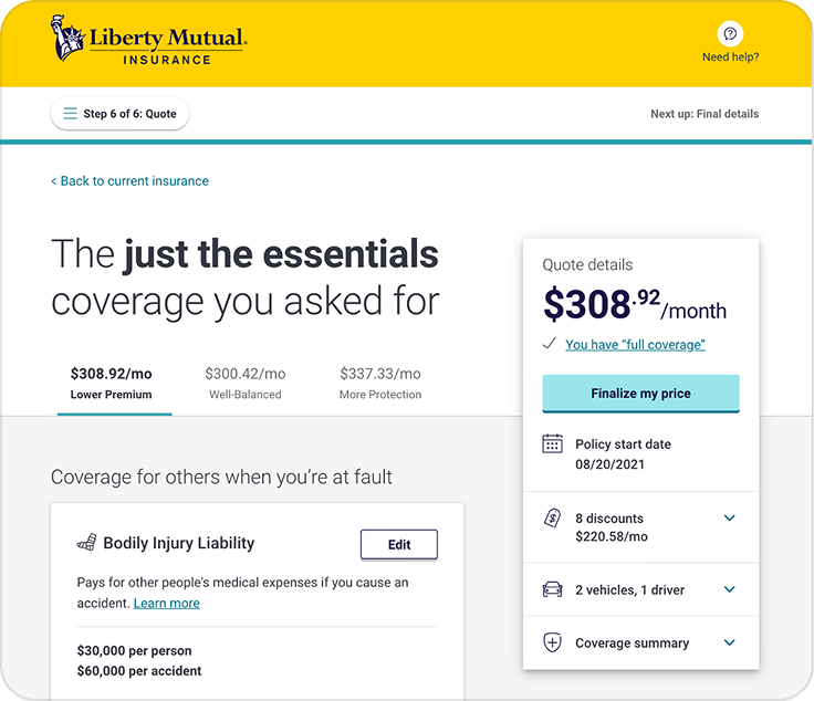
RATE & COVERAGE PRESENTATION
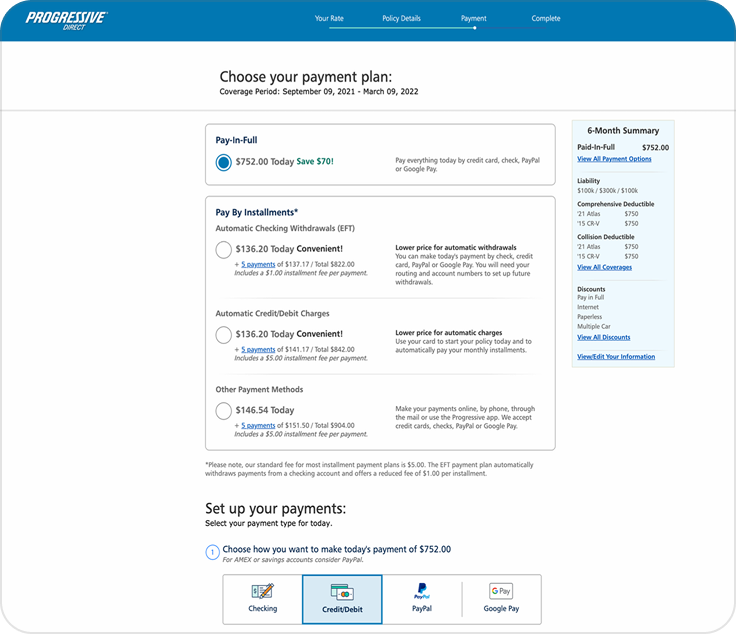
PAYMENT PLANS
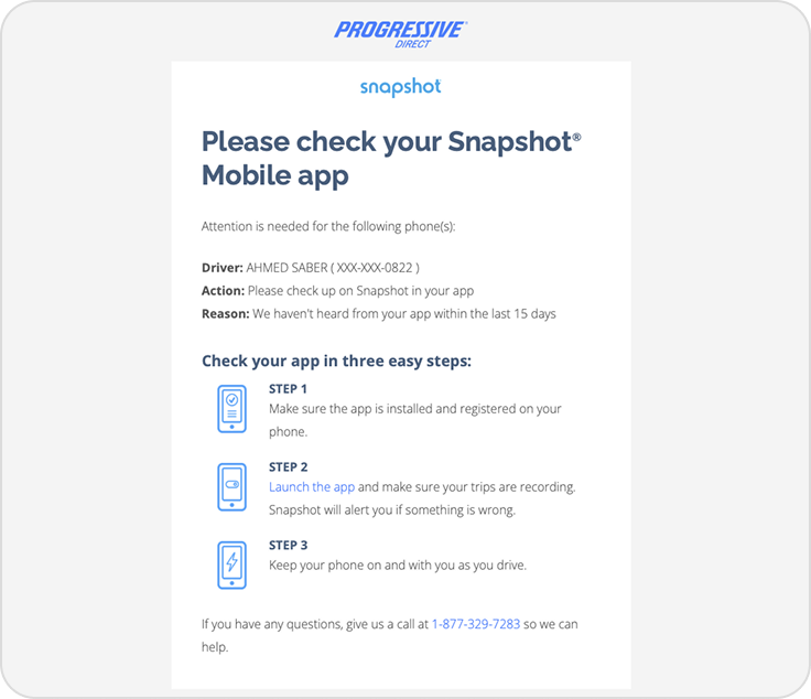
POST-SALE EXPERIENCE
I then partnered with product and engineering to design and build the end-to-end purchase journey.
This helped the team to indentify any technical constraints that would require key technologies to implement an online checkout experience and key moments for a user.

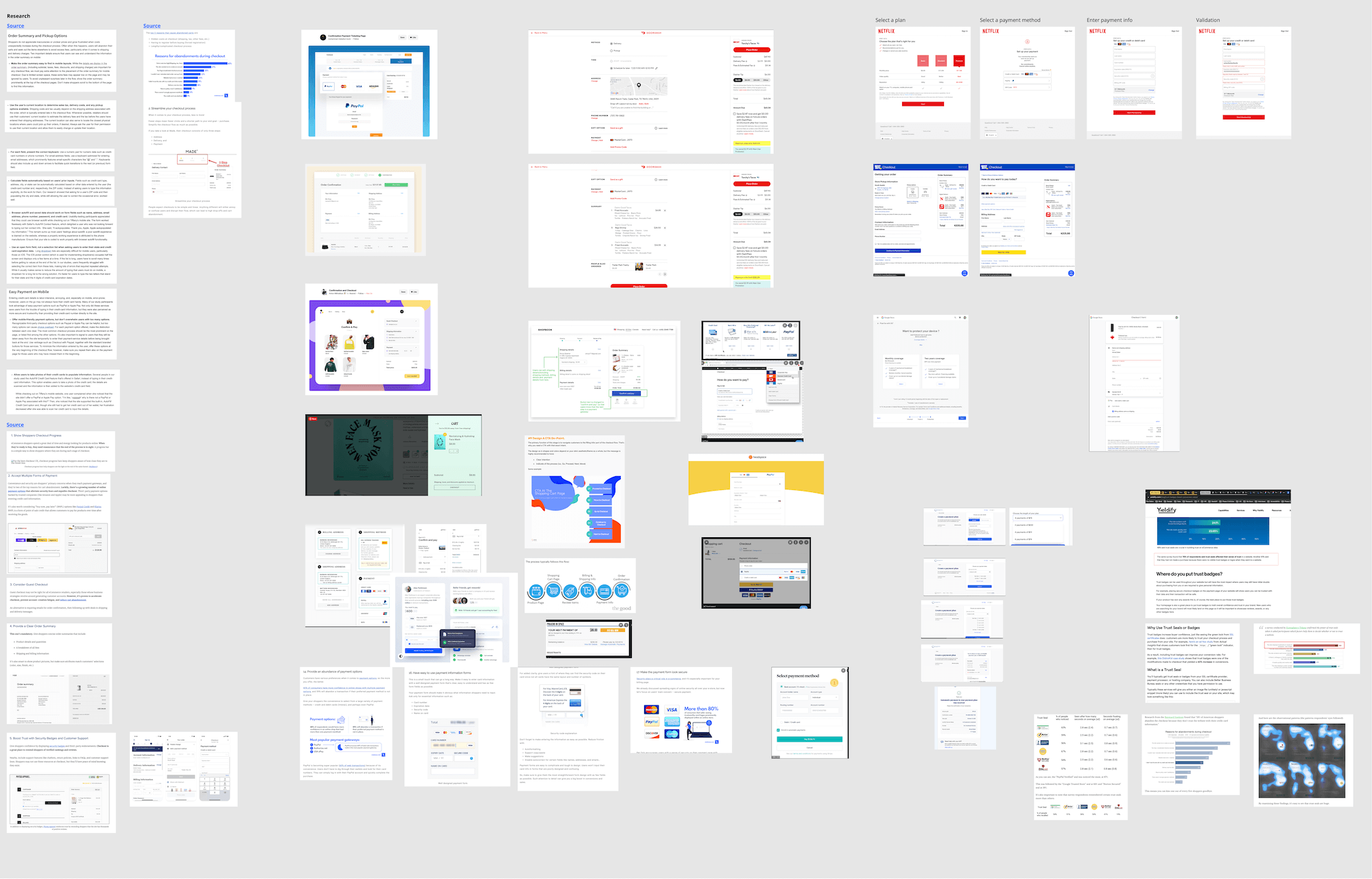
I explored UX best practices for checkout flows across multiple industries including e-commerce, travel, fintech, and insurance. This helped me identify patterns that balance clarity, trust, and ease of completion.
Key findings showed that clear step-by-step flows, trust-building elements, and in-context guidance are key for complex checkouts.
DESIGN
Explorations
I designed within technical and regulatory constraints to support a dynamic, carrier-specific purchase flow.
Partnering with Research helped validate assumptions and guide us toward the right direction.
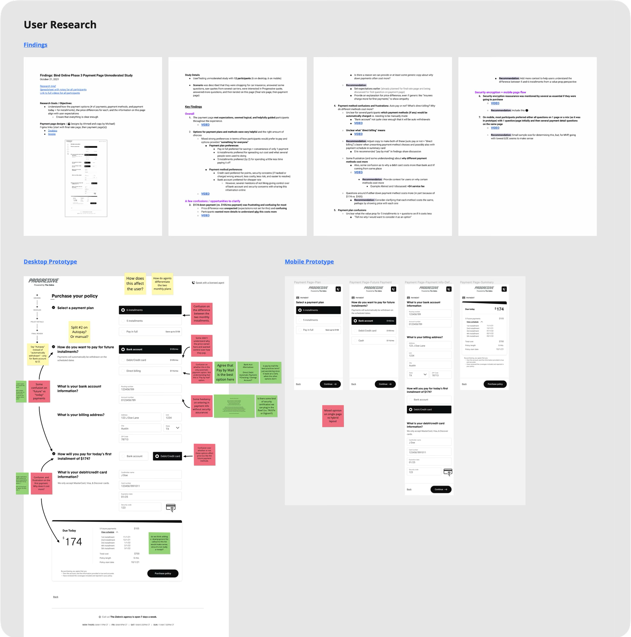
In partnership with Research, we discovered three key findings:
Jargon blocks clarity
Insurance terminology confuses users and blocks clear understanding, making decisions harder.
Context drives decisions
Users rely on in-the-moment context to make confident, informed choices.
Confusing payment methods
Users find it hard to compare plans due to similar lengths and hidden fees.
CARRIER QUESTIONS
FINAL RATE/COVERAGES
CHECKOUT
POST-SALE
STEP 1
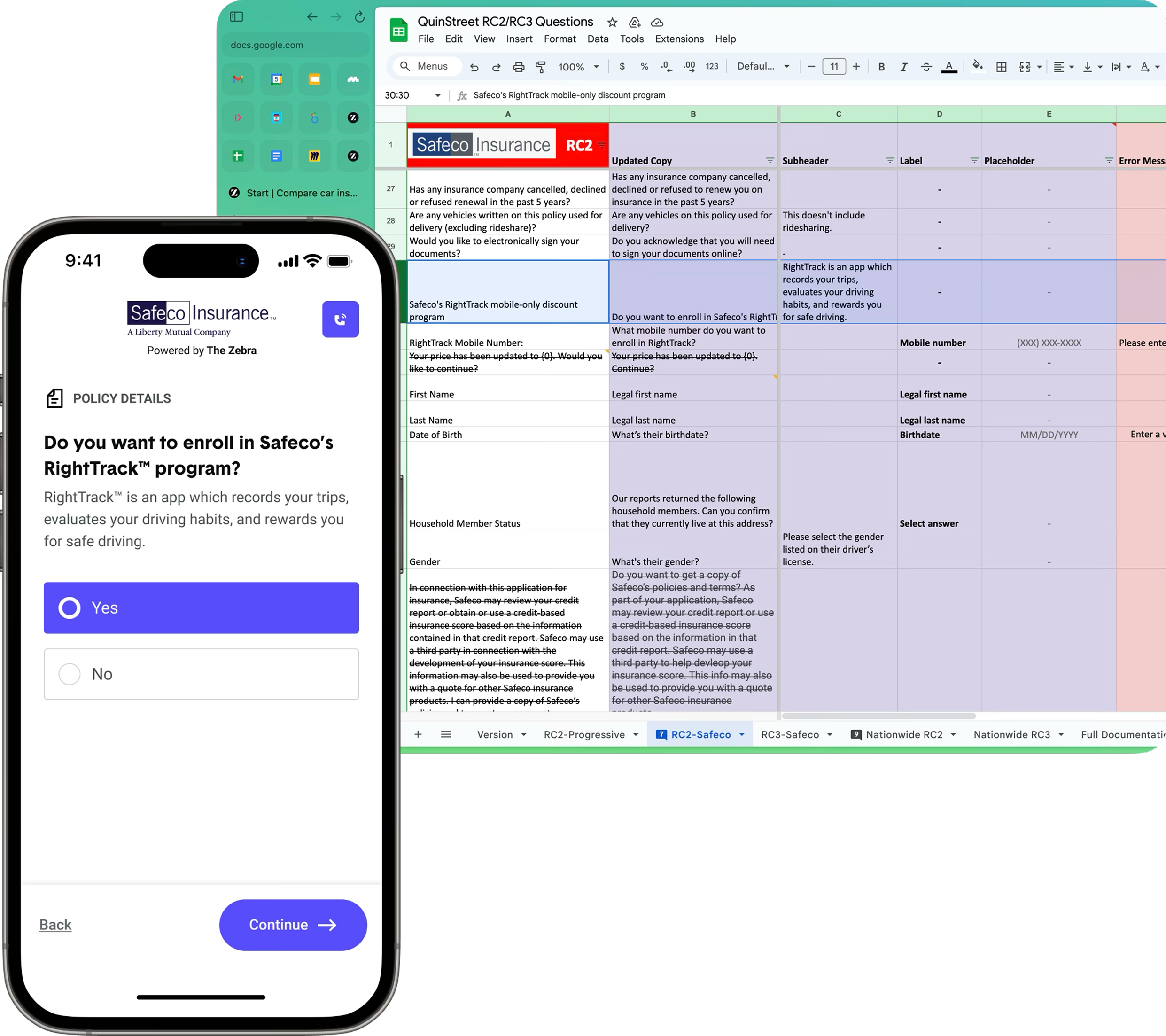
Carrier Questions
Simplified complex insurance concepts and overcame carrier content and compliance challenges through collaboration with Content and Product teams.
STEP 2
Final Rate/Coverage Presentation
Created a dynamic user coverage presentation that highlighted the primary CTA, provided clear coverage context, and maintained design consistency through collaboration.
Research showed that users needed clear coverage context alongside the rate to confidently decide and purchase a policy.
ABOVE FOLD
BELOW FOLD
STEP 3
Checkout
Designed for dynamic, complex carrier payment plans despite third-party limitations.
Ensured clear error messages and used illustrations to educate users in collaboration with Content.
PAYMENT PLAN
PAYMENT INFO
STEP 4
Post-Sale
I balanced multiple page goals and e-sign requirements by designing clear success messaging, next steps, and directing users to the carrier portal.
ABOVE FOLD
BELOW FOLD
EVALUATIVE RESEARCH
Similar or better than carriers
“This is a really straightforward, easy website to use… It’s very similar to what I’ve experienced when purchasing my car insurance.”
Clear and easy-to-understand copy
“I really like how easy it is to follow. Insurance has always gone over my head. This I get.”
Users felt comfortable purchasing
“I feel very comfortable completing this whole process again… It’s definitely easier and clearer than other sites I’ve used.”
Impact
3
major carriers integrated
↑30%
in policies in force
71%
checkout conversion rate
Challenges and key lessons learned
Here's an overview of what challenged me the most and what I’d do differently next time.
Challenges
Managed extensive stakeholder approvals, shifting requirements and teams, and carrier-specific complexities.
Learnings
Aligned with Product and Engineering through open communication, improved cross-functional syncs and documentation, enabling faster launches with updated Design System components.
© Ahmed Saber 2025