RxSaver
Funnel Improvements
To boost conversions and stay competitive, RxSaver improved its core Price Comparison view using insights from user research making it easier for users to find and apply prescription savings.
UX Designer
2019-2021
Consumer - Web
Health

PROBLEM
How Do We Keep Improving as Users and Competitors Grow?
RxSaver is a free prescription savings tool that helps users find coupons and save up to 85% on their prescriptions. As users grow, how do we continue to improve our user experience, improve our funnel conversion, and compete against our growing competition.

SEARCH

COMPARISON

COUPON
How might we improve the user experience and funnel conversion so that more users find and use savings successfully?
SOLUTION
Targeted optimizations focusing on enhancing the Price Comparison view increasing conversion.
ROLE
Led web design efforts by collaborating with Product and Engineering to identify user needs, align with business goals, plan and prototype for both moderated and unmoderated research, define MVP within constraints, present to stakeholders, and ensure smooth implementation through detailed documentation, asset handoff, and QA.
DISCOVERY
Behind the Price Comparison View Redesign
The Price Comparison view is one of the most critical pages for both users and the business, often serving as the "Aha!" moment when users discover price differences across pharmacies. Over time, this view has undergone multiple iterations driven by user research. This project focuses on the most recent major redesign of the page.

RESEARCH
After the release of v3 of the Price Comparison view we continued to test the design out and received the following feedback:
- Some users missed the header and ZIP code selection.
- Confusion around “generic [Brand Name]” labels.
- Many overlooked strength and quantity defaults, causing pricing confusion.
- Edit CTA was not prominent enough.
- Several users were unclear about what the prices represented.
- Overall, the page appeared unfinished or “beta” to many users.
DESIGN
Explorations
I created low-fidelity mockups to quickly explore design concepts, test workflows, and gather early feedback before investing in detailed visuals, enabling rapid iteration and alignment with stakeholders.


PROPOSAL
Focused Updates to Enhance Visual Hierarchy and Clarity
Based on extensive user research and testing from 2020-2021, the following updates aim to improve hierarchy, discoverability, and reduce confusion on the Price Comparison page.
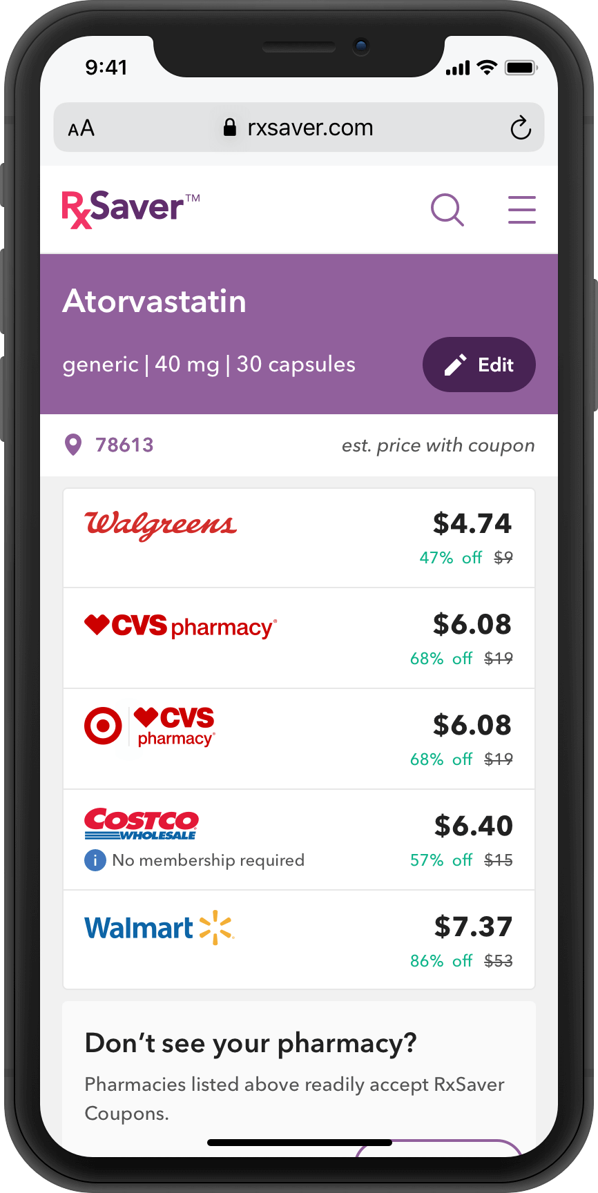
KEY UPDATES
- Improved header layout and color palette for clearer hierarchy
- Redesigned Edit CTA as a pill button for better visibility
- Simplified location info with clickable ZIP Code
- Replaced cards with rows for easier scanning and more content above the fold
- Added pharmacy logos for brand recognition
- Clarified pricing with “est. price with coupon,” retail price, and savings details
TEST
Research Methods & Testing Approach
I conducted a mix of moderated and unmoderated studies across multiple design iterations, including balance comparison tests, live site vs. prototype evaluations, and competitive comparisons with top industry alternatives.
KEY UPDATES
- All participants preferred the new, more visually clear design
- Most easily adjusted dosage and location
- Pricing was clearer and savings appreciated
- Layout was easier to scan with more offers visible
- Pharmacy logos added trust
- Majority favored our design over competitors
Impact
Driving higher conversion through improved UX.
↑24%
in conversion from price comparison to coupon page
NEXT STEPS
The team has been making continual improvements to the core flow including the price list view. You can view the updated header and pharmacy logos on the live RxSaver site. The redesigned offer card with retail price and savings is scheduled for May 2021. Each update is A/B tested to ensure improvement to conversion and continually tested in future unmoderated/moderated user research studies.
© Ahmed Saber 2025