RxSaver
Design System
Building consistency across the product, we developed a simple, scalable design system that streamlined collaboration, reduced debt, and improved the user experience.
UX Designer
2019-2021
Consumer - Web
Health
PROBLEM
Growing Pains: Inconsistencies at Scale
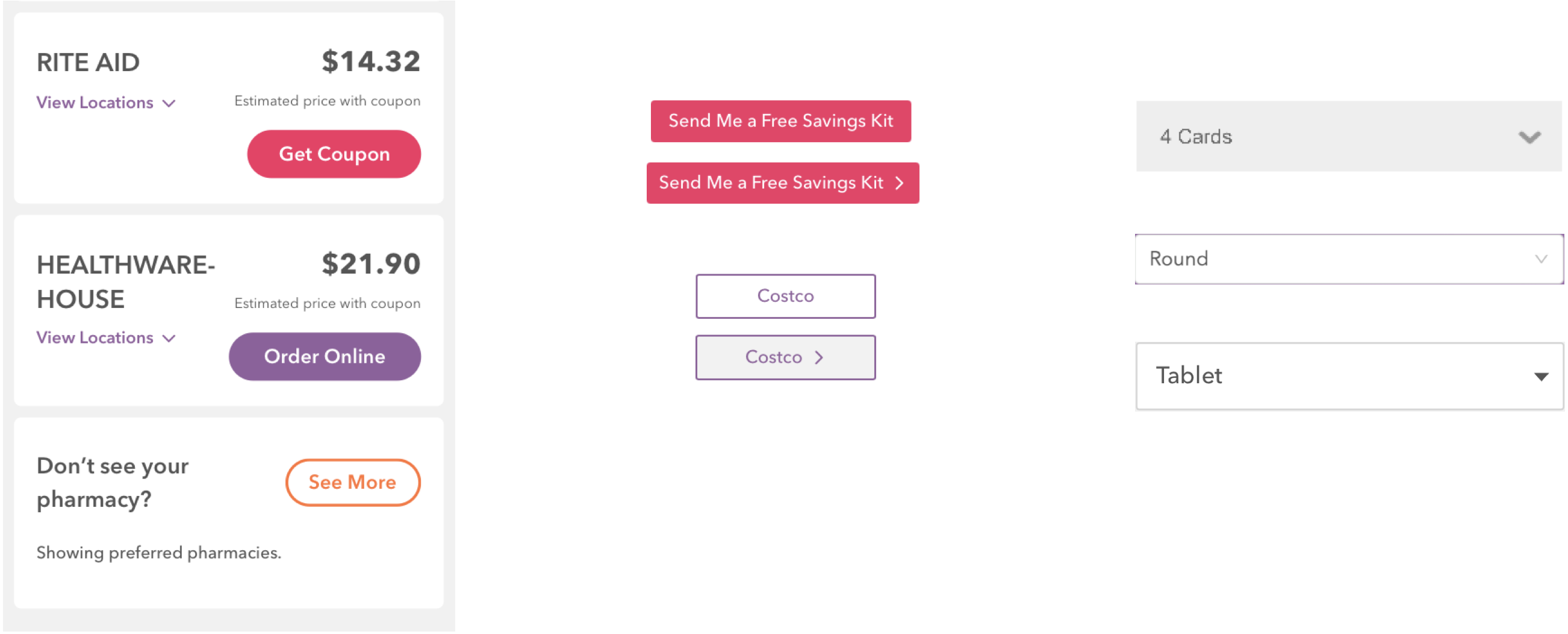
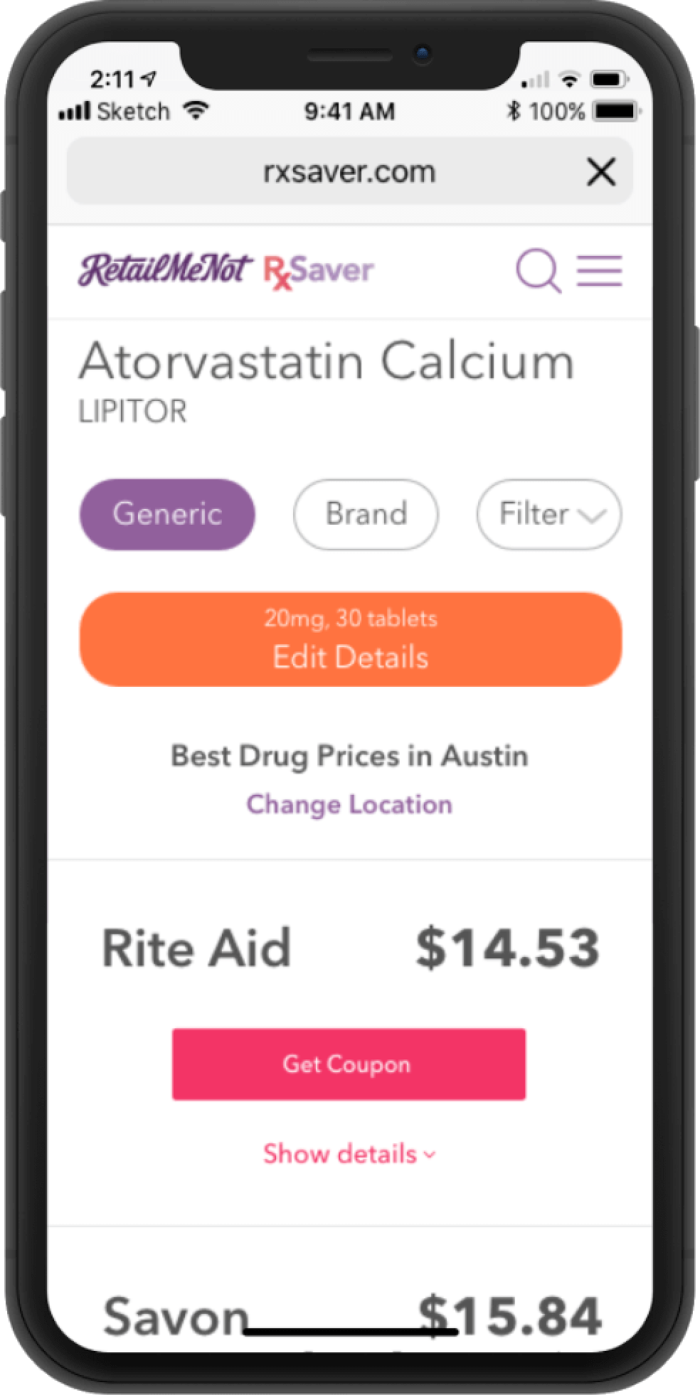
As the product and team grew, so did visual inconsistencies—one page alone had four buttons, each with a different style and behavior.
How might we create a unified design system so that teams can build consistent, high-quality experiences at scale?
SOLUTION
Build a simple, scalable design system to drive consistency, reduce debt, and improve collaboration and user experience.
ROLE
Led contributions to the RxSaver web design system, maintaining and updating assets in Sketch and Zeplin, and partnering with Engineering to build a reusable React component library.
DISCOVERY
Establishing a Baseline for Consistency
I began with a comprehensive component audit to identify inconsistencies and set a clear starting point for unifying the design system.
RESEARCH
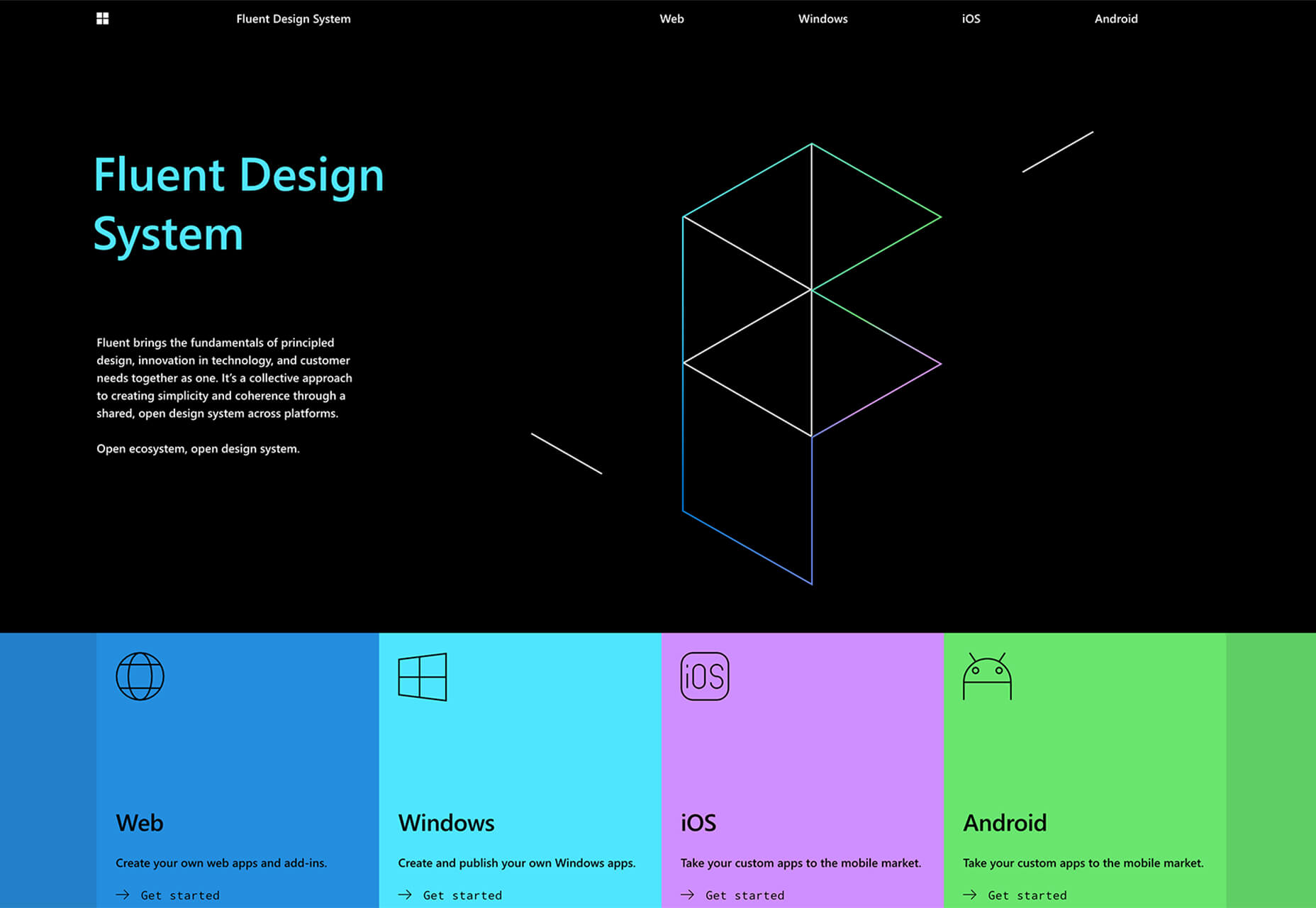
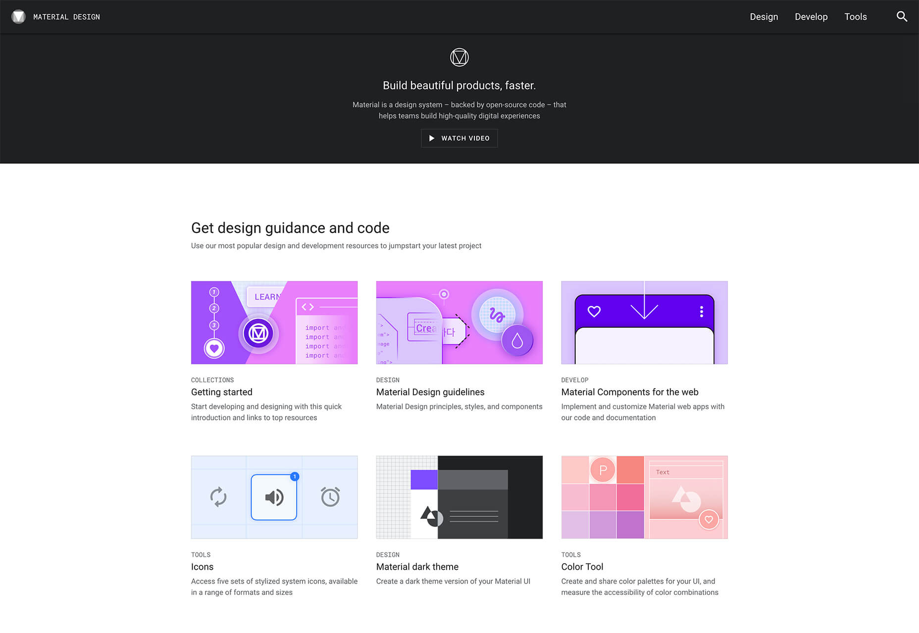
Researched leading design systems like Material, Fluent, and Human Interface Guidelines to ensure our system was accessible, consistent, and built on proven best practices.
KEY FINDINGS
- Clear foundations enable consistent UI
- Reusable components speed up workflow
- Accessibility must be built in from the start
- Strong documentation ensures adoption
- Cross-platform support creates cohesive experiences
- Governance prevents drift and maintains quality
Guiding principles
Leveraging insights from research and close collaboration with Engineering, we defined design principles to ensure the system works seamlessly for both users and the team.
Consistent
Create a unified design and engineering language with clear, user-friendly components.
Accessible
Design products that are inclusive and meet WCAG AA (ADA) standards.
Scalable
Build flexible designs that adapt to current and future needs.
DESIGN
Design Kit
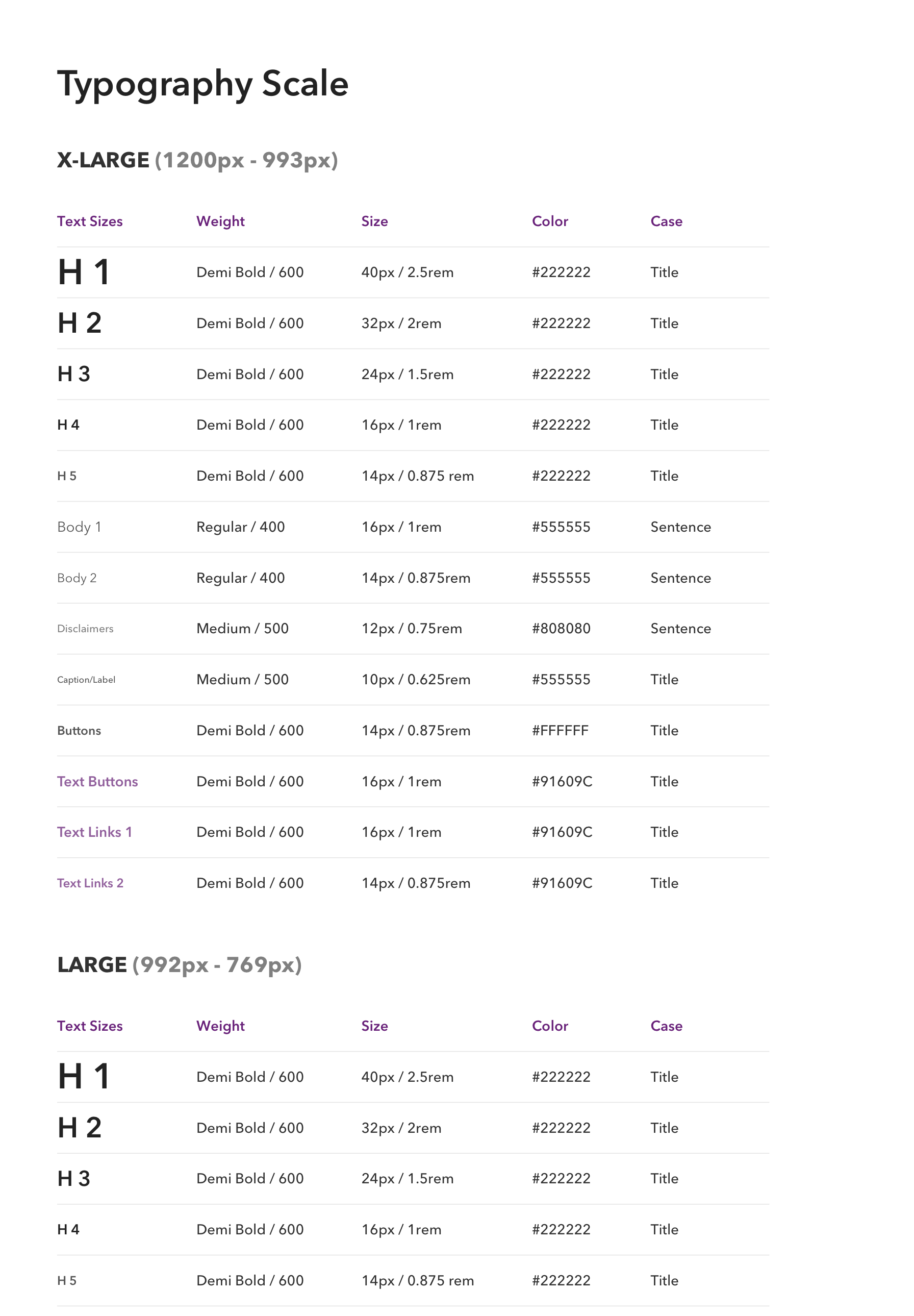
Partnering with Design and Engineering, we prioritized key components to empower teams to deliver faster, smarter, and more efficiently.
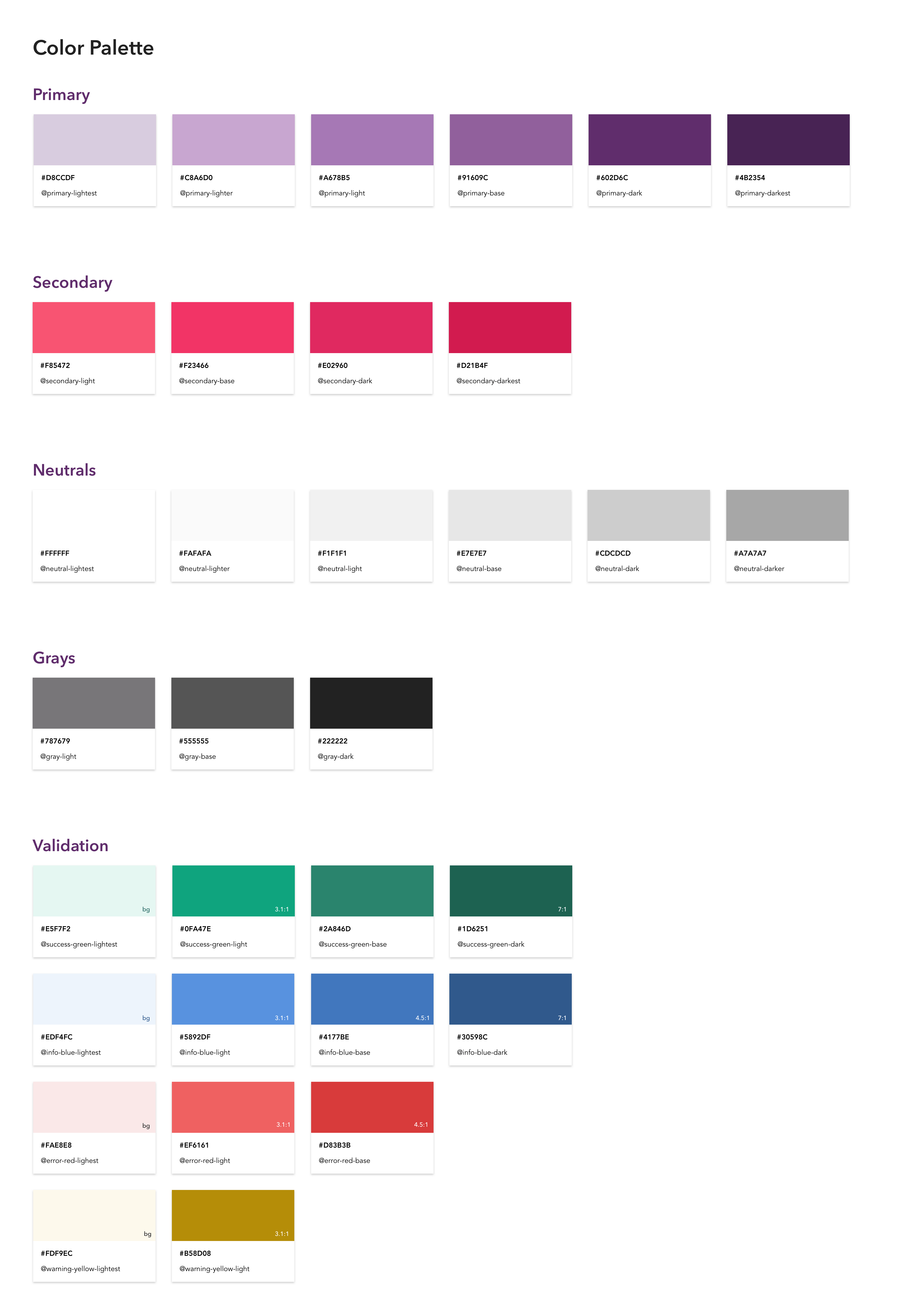
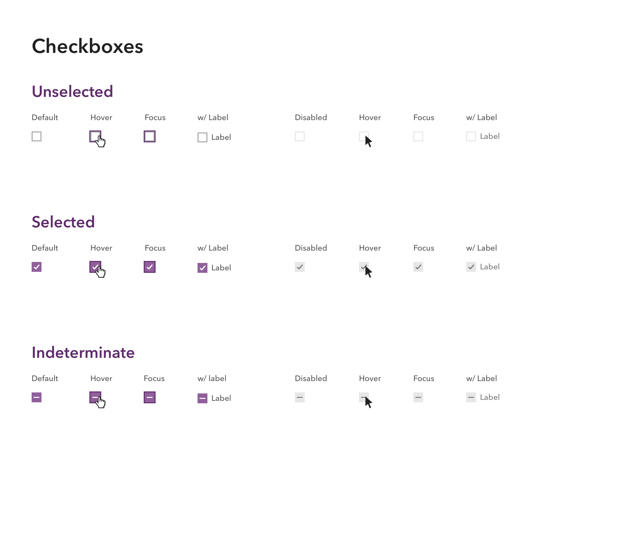
Components
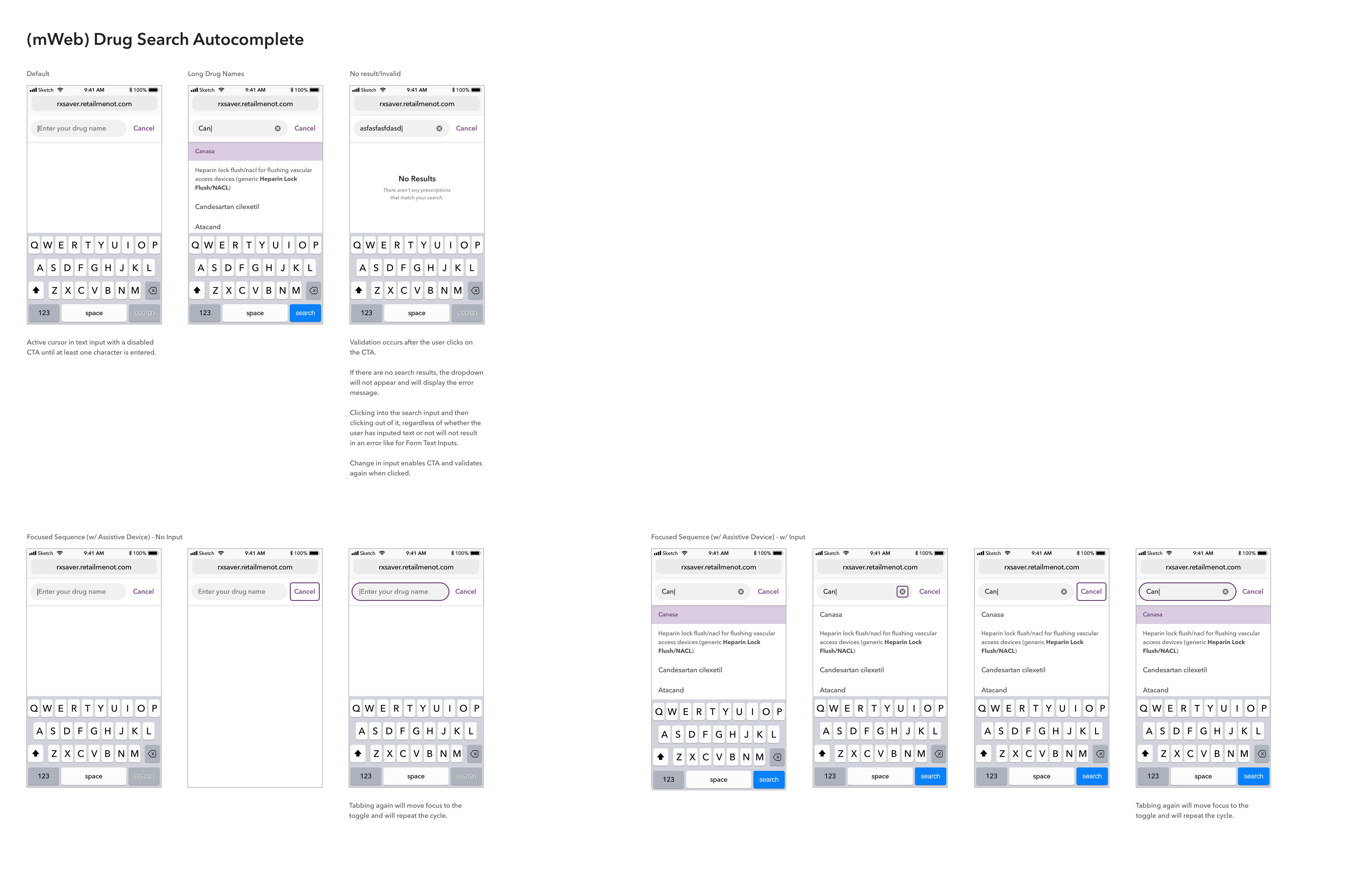
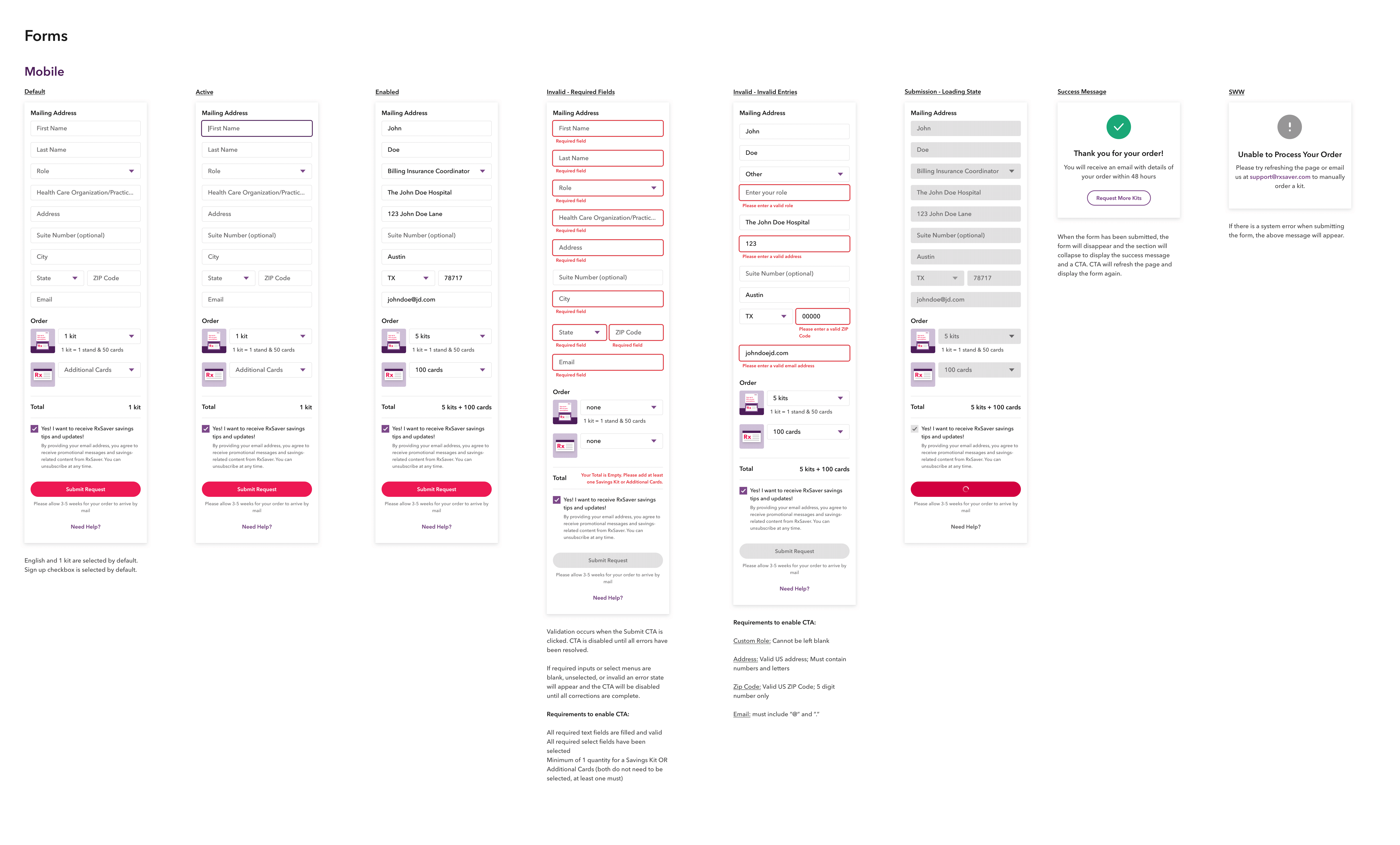
Here are some examples of basic components—the building blocks that combine to form patterns.
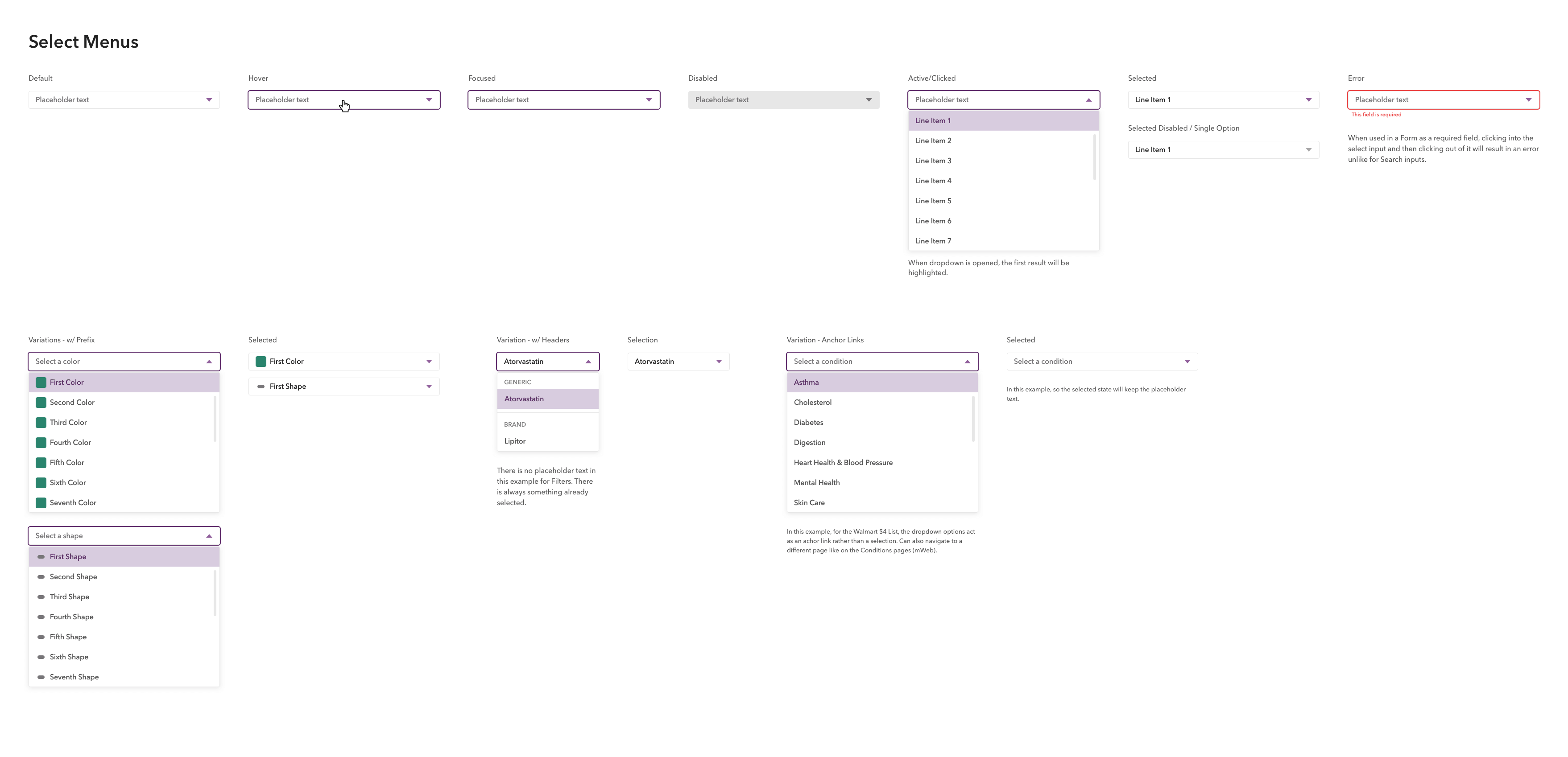
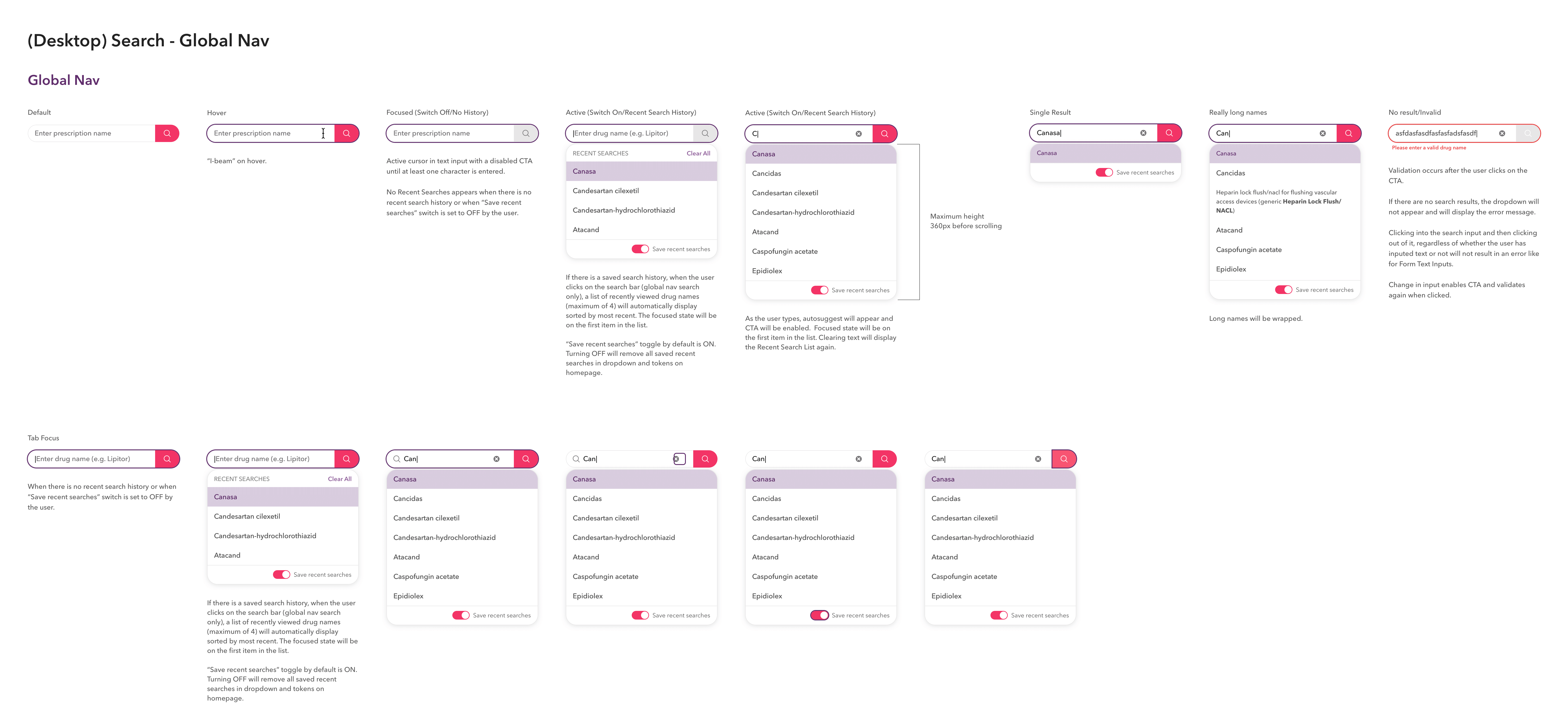
Patterns
Here are examples of patterns composed of various components.
IMPLEMENTATION & IMPACT
Shared Components, Lasting Impact
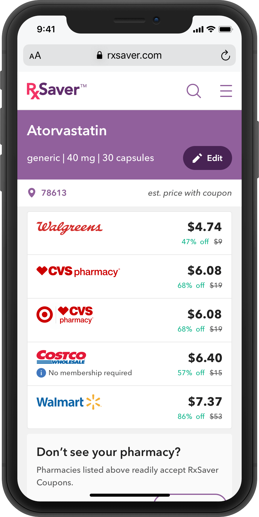
Collaborated with Product and Engineering to prioritize and develop shared React components, boosting productivity, accelerating time to market, reducing costs, delivering consistent quality, and supporting scalable design team growth.
BEFORE
AFTER
Challenges and key lessons learned
Here's an overview of what challenged me the most and what I’d do differently next time.
Challenges
Building and maintaining a scalable, accessible design system while balancing team responsibilities and technical complexities was a continuous challenge.
Learnings
Strong collaboration, clear processes, and ongoing accessibility focus are essential for a sustainable design system.
NEXT STEPS
The RxSaver Design System continually evolves based on user feedback, new use cases, improved patterns, and enhanced documentation. In 2021, our focus is on achieving full ADA compliance across all platforms, including updating to a more accessible color palette to ensure everyone can use our product.
© Ahmed Saber 2025